In this blog post I elaborate on anti-aliasing in R. Some feedback I received quite a while is that the plots produced by ggplot2 in R aren’t as pretty as those produced by Microsoft Office, or even Python’s Matplotlib. This feedback is justified, because R doesn’t anti-alias it’s produced plots. So I searched and somewhere in Egypt I found a solution.
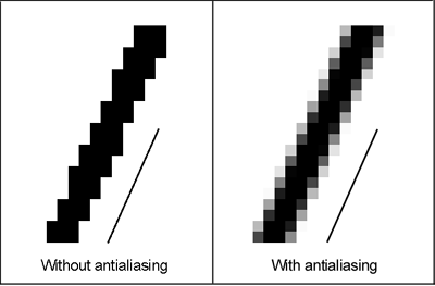
What is anti-aliasing? Wikipedia defines it as: “a technique for minimizing the distortion artifacts known as aliasing when representing a high-resolution image at a lower resolution.” In other words, in the real world, a diagonal line looks nice. But your computer uses a monitor with a two-dimensional grid with pixels. To draw that diagonal line, you can’t colorize half a pixel. Enter: anti-alising.
There are many ways to anti-alias an object, but the image below represents a common one. The pixels close to your diagonal line are colorized in a color that’s somewhere in between the line and the other pixels nearby. A black line on a white background produces some extra pixels in a shade of grey.
That’s why your plots produced by R look ugly: the objects within it aren’t anti-aliased. At least… in Windows. Because anti-alising already works out of the box in R on MacOS. If you have you produced visualizations in R on a MacOS device, you might have noticed that they look much smoother.
The solution in Windows is to switch to another rendering engine that does provide anti-alising. A good option is Cairo. It’s open source. It’s device-independent, which means it will produce the same result on every device. And you can install the Cairo library easily and load it as follows:
install.packages('Cairo')
library('Cairo')
CairoWin()
The CairoWin() function initializes a new graphics device that uses the cairo graphics library for rendering. If you use ggplot now, your plots will be rendered in a new window that uses the cairo library. Here is an example:
data('nhtemp')
dt <- data.table(nhtemp)
dt[,year := ymd(paste0(seq(1912,1971,1),'-01-01'))]

g <- ggplot(dt,aes(x = year, y = nhtemp, group = 1)) +
  geom_line(size = 1) +
  geom_point(size = 3)
You can save your images by providing the parameter type=’cairo’ to the ggsave() function.
ggsave(g, filename = 'nhtemp_with_cairo.png', dpi = 300, type = 'cairo',
       width = 8, height = 4, units = 'in')
Here’s the difference. This one is with anti-alaising:

And this one is without anti-alaising:

The difference? Take a look at this:

By the way, if you’re having trouble understanding some of the code and concepts, I can highly recommend “An Introduction to Statistical Learning: with Applications in R”, which is the must-have data science bible. If you simply need an introduction into R, and less into the Data Science part, I can absolutely recommend this book by Richard Cotton. Hope it helps!

Thank you for this! Have been looking for hours to solve the jagged lines problem.
Glad I could help, Chris!
Hello, so I found this post by accident. If you use R studio, the newer versions should have an option to swith to the cairo graphics device by default. It’s under options, general, graphics.
The problem is when you use R outside of R studio, it tends to pick the default windows driver. :/
I wonder if there is a way how to force R to use the cairo engine, without the need to generate a .png somewhere. It’s probably some kind of dev option somewhere.
Many thanks for this. I was using Cairo 5 years back just for this, then I kind of dropped it because plotly::ggplotly() does it by default… now I need png files for web use without JS… googled this post and am so delighted. I worked in geophysics/signal processing and anti-alias was a *must* obviously in field recordings but some folks don’t ‘get it’ with spatial aliasing.
quos doloribus exercitationem atque ex ratione ullam molestias fugiat. nobis sunt optio at excepturi magnam libero qui veritatis sint sequi repellendus commodi officia reprehenderit. dolores at a labore quasi ducimus et neque eveniet nam impedit ipsa sint reprehenderit quam.