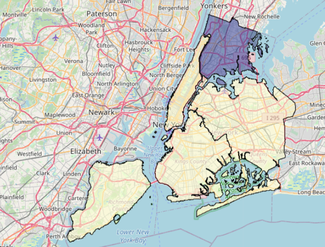
In this blog post, we’ll use GeoPandas and Folium in Python to plot a choropleth map of New York’s unemployment rate per borough. Not because it’s extremely interesting, but because it took me a while to get all the elements in order, and I want to help you save some time.
- First, I load all necessary packages.
- Next, I load the ‘nybb’ example dataset.
- Set to WGS projection (EPSG:4326)
- Add a column with unemployment numbers (August 2021).
- Change the column type of BoroCode to string.
import folium
import pandas as pd
import geopandas as gpd

path = gpd.datasets.get_path('nybb')
df = gpd.read_file(path)
df = df.to_crs(epsg = 4326)
df['unemployment'] = pd.Series([4.0, 4.6, 4.5, 4.2, 9.1])
df['BoroCode'] = df['BoroCode'].apply(lambda x: str(x))
This is the resulting table:


Next, we’ll turn our geometry column into a GeoJSON.
- Because you’ll want to join your unemployment data on the JSON, make sure you set it as the index!
- Equally important, make sure you converted it to a string in the previous step, otherwise your join won’t work.
geo = gpd.GeoSeries(df.set_index('BoroCode')['geometry']).to_json()Next, create the Choropleth.
- We have a GeoJSON that contains the geographical data. It is passed to the geo_data parameter.
- We have our DataFrame that contains the unemployment data (columns ‘BoroCode’ and ‘unemployment’), passed to the data parameter. We join it on the GeoJSON’s ‘feature.id’ key.
m = folium.Map(location = [40.70, -73.94], zoom_start = 10)
folium.Choropleth(
    geo_data = geo,
    name = 'Choropleth',
    data = df,
    columns = ['BoroCode','unemployment'],
    key_on = 'feature.id',
    fill_color = 'YlGnBu',
    fill_opacity = 0.5,
    line_opacity = 1,
    legend_name = 'Unemployment (%)',
    smooth_factor=  0
).add_to(m)
Finally, render the map. Due to the complexity of the polygons, you might want to use the following method instead of simply printing the map if you’re using Jupyter.
def embed_map(m):
    from IPython.display import IFrame
    m.save('index.html')
    return IFrame('index.html', width='100%', height='750px')
embed_map(m)
And there we go: